Hey everyone!
How are you doing? Hope everyone's fine! It's been a hectic couple of days at work as far as I'm concerned, however everything is great. I managed to get some free time so I had the opportunity to work on another Cartography blog, which means I'm ready for another part of this series. No time to waste though, so let's do this!
As promised in a previous Cartography post about Color Systems, I'm back with the eleventh part of this series. This time I'm taking the chance to share broad information regarding the utilization of pattern and color in the symbolization of qualitative characteristics. We will also discuss general information concerning Color Standards and take a deeper look at the four main categories of Pattern Standards that are used by Cartographers nowadays, so stay focused!
Keep in mind that this is an introductory series, which basically means that I will do my best to present general technical information in a simplified manner so that we can discuss interesting stuff about Cartography in a fun way. There's always a high chance of learning a thing or two by reading through these blogs, so stay tuned!
Image Source: pixabay.com (CC0 Creative Commons Author: Prawny)
Color Conventions
Hue is one of the most significant attributes of color and one of the three dimensions of 3D color space, as explained in a previous post. The combination of color and pattern is essential in the design of mappings and provides Cartographers with the necessary graphic elements that are mainly utilized for the precise depiction of qualitative differentiations. The need for the creation of such complicated graphic tools was induced by the fact that patterns of the same texture and colors of the same intensity and saturation cannot be utilized in order to provide observers with information regarding the variation in magnitude of the geographic phenomena depicted.
The process of deciding which particular hues and patterns will be selected for the depiction of certain geographic phenomena according to the map's purpose is dictated by multiple factors, one of the most significant of which is Color Conventions. Color Conventions are statements that clarify which colors are considered as appropriate options for the depiction of specific geographic entities. This way various sorts of possible misconceptions between cooperating professionals are avoided. The most common International Color Coventions that are followed by Cartographers and Engineers in general nowadays are actually four simple rules, as demonstrated below:
- Blue color for the depiction of water surfaces.
- Green color for the depiction of vegetation.
- Brown color for rock surfaces.
- Yellow color for dry land surfaces.
Those primary rules are in place in order to ensure that observers and users can extract qualitative information from mappings without the need for qualifications or professional experience. Conventions are followed to ensure that any possible confusion is eliminated and therefore are very useful tools in cartographic design, however those tools come with cons and place restrictions on the Cartographer's options regarding graphic elements and symbols. Another significant factor, which plays an important role in the process of deciding which hues and patterns should be utilized according to a map's purpose, is Color Standards. Let's take a deeper look.
Image Source: pixabay.com (CC0 Creative Commons Author: Geralt)
Color Standards
Color Standards have been adopted and utilized by government agencies and map companies in the production of various categories of mappings. Each Color Standard is mainly comprised of all Color Conventions regarding hue that have to be followed and taken into consideration. It is also worth noting that each Color Standard is defined by the hue of the printing ink utilized and the percentage of transparency of the color. It is worth mentioning at this point that the U.S. Geological Survey use six different solid hues (100%), whereas the Defense Mapping Agency utilize hues that are produced by combining different tonal gradings of specific varieties of printing ink.
Color Standards are useful tools that enable scientists to exchange information with efficiency and precision, however those tools come with specific restrictions and sets of rules. Those rules applied have to be followed in all mappings that belong in the same production series; for instance Cartographers have to replicate and reproduce the exact same hues in all successive mappings of a series. The utilization of standardized colors is also necessary for topographic mappings of the same geographic areas that are updated periodically, due to the fact that professionals and scientists that use those mappings are aware of the existence of Color Conventions and expect to spot specific matchings between geographic phenomena and certain colors.
Furthermore, there are multiple examples of many companies which adopt specific Color Standards in order to manage to produce unique mapping series with end products that differ to the competitors' ones. There is a wide range of Color Standards which were formed and set in various ways and gave colored cartographic design grounds for development of depiction techniques and methods of demonstrating qualitative information with efficiency. Some Color Standards were created based on our optic system's attributes and the theories of color vision, whereas others were based on design principles borrowed from other fields. Extensive research prior to utilizing Color Standards is essential in order to achieve maximum efficiency by exploiting each system's uniqe characteristics. Below is the RGB systems' color wheel.
RGB Color Wheel./ Image Source: commons.wikimedia.org (Creative Commons Attribution-Share Alike 3.0 Unported Author: DanPMK)
Pattern Standards
Patterns are mainly used as qualitative symbols that serve the purpose of depicting spatial characteristics of geographic entities with precision. There's a wide range of qualitative characteristics that can be projected and observed with the utilization of color, from climatic conditions and ground types of an area to the administrative organization and vote preference of its citizens. The addition of graphic discreteness to uniformly colored surfaces in cases of mappings that demonstrate various categories of qualitative characteristics is a common phenomenon. Scientists nowadays can pick between hundreds of different patterns, which can be classified into four main categories as demonstrated below:
Linear Patterns.
Linear patterns consist of straight lines, however there are also cases of linear patterns that are mainly comprised of corrugated parallel lines. Those different linear elements may as well intersect each other vertically or at different angles. The optical outcome of this process is known as cross hatching.Point Patterns.
Point patterns consist of circular dots placed in triangular or rectangular formations. There are even cases in which the way those dots are placed on the projection's surface is completely random. The irony, patterns following no patterns. An equal scaled irregular distribution is the usual optical outcome of this pattern.Pictorial Patterns.
Pictorial Patterns tend to bare similarities with the spatial characteristics of the geographic entities depicted. There is a wide range of pictorial patterns, from symbols that resemble trees and fences, to unique symbols that represent the existence of cemeteries or hospitals in our area of interest.Inverted Patterns.
Inverted Patterns refer to the three categories mentioned above. Patterns are represented in white color and are placed on a uniformly colored background. The reason why this technique is utilized lies in the fact that it is actually a lot easier for the observer to read letters or cartographic symbols placed on inverted patterns.
Many of those patterns mentioned above have evolved into conventions or standards in various thematic fields, one of which is Geology and I had to let you know since I have this other Introduction to Geology series going on. Standard Patterns utilized in the production of the U.S. Geological Survey's series of topographic mappings include pictorial patterns used to depict water surfaces, point patterns used to represent dry surfaces, and linear patterns used in order to represent mountainous areas with various ground formations. Observers and professional users of those mappings are used to reading those specific patterns as mentioned and therefore it is necessary that the same patterns are used to present the same spatial characteristics in every map.
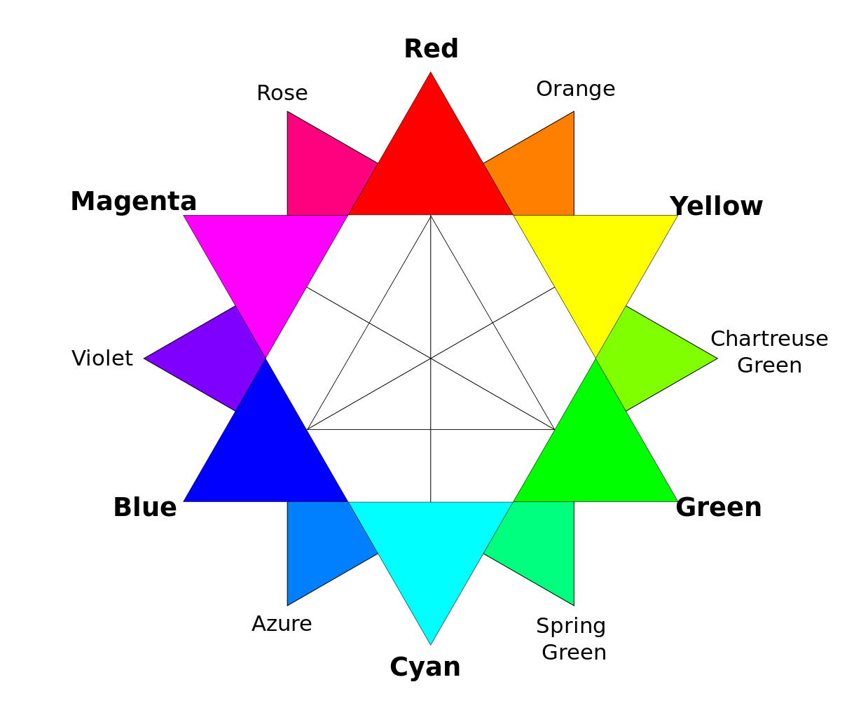
It is rather important that Cartographers always keep in mind to not choose linear patterns or point patterns that demonstrate systematic variations in texture. The technical reason is that such variations would create the illusion of magnitude variation and therefore convey to the observer the false message that there's only one category of spatial characteristics presented on our map, and that the main objective of the end product is to provide information regarding magnitude. However, stay tuned as we will soon find out on the next part of the series that quantitative characteristics can be depicted with the utilization of patterns that include systematic variations in texture. Oh by the way, here's the RYB system's color wheel.
.svg.png)
RYB Color Wheel./ Image Source: commons.wikimedia.org (Creative Commons Attribution-Share Alike 4.0 International Author: Kwamikagami)
Unique & Mixed Hues
Cartographers tend to pick hues according to their uniqueness. As explained previously in a Cartography blog regarding 3D Color Systems, the Opponent Process Theory of color vision is based on the human ability to see blue, green, read and yellow color as unique hues that can produce all other hues there are if combined properly. All combinations between two different hues are possible, apart from the BY (Blue-Yellow) and RG (Red-Green) combinations, due to the fact that those pairs of colors are actually opposite of each other and therefore produce grey color when combined. Some Cartographers consider brown color as one of the unique hues there are, whereas others consider this color to be a product of the combination between red, yellow and black.
Both unique and mixed hues are utilized for the accurate and efficient depiction of qualitative characteristics in various ways. Unique hues are mainly used for the symbolization of discreetly different phenomena, whereas a combination of two unique hues that are not opposite to each other can be utilized for the depiction of geographic phenomena that bare some of the characteristics of the elements symbolized by both unique hues. For instance, in cases of thematic maps regarding population of different nationalities, we can use two specific hues for areas inhabited by citizens of the same nationality, whereas we can create mixed hues by applying population percentages in the combination of colors utilized in areas where people of various nationalities reside. This serves as an example of qualitative characteristics of geographic entities depicted through the utilization of color and pattern.
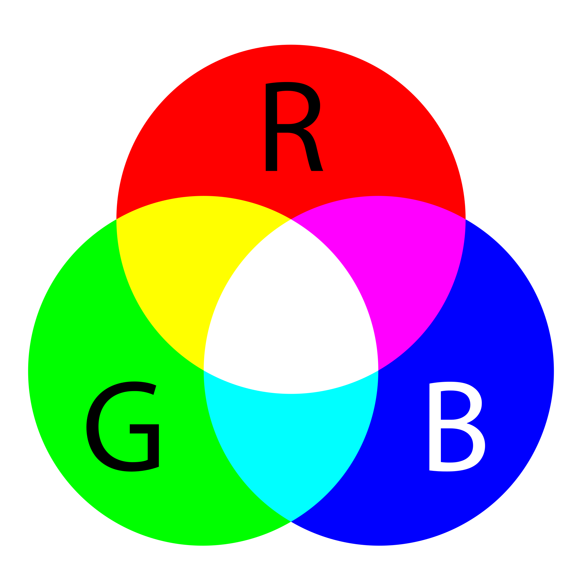
Primary & Secondary Colors./ Image Source: commons.wikimedia.org (Public Domain Author: SharkD)
Alright everyone, that's it for now! I appreciate you taking the time to read this blog. That brings us to the end of this eleventh part of this series. Feel free to let me know should there be any questions in the comments below and I will do my best to provide prompt and detailed answers. Thanks for being here, stay awesome and follow me for more Engineering blogs! :)
PREVIOUS PARTS OF THE SERIES:

IMAGE SOURCES:
REFERENCES:
University Textbooks & Course Lectures:
Χαρτογραφία Ι/ Cartography I -TSOULOS(National Technical University of Athens, School of Rural & Surveying Engineering, Course Lecture Notes)
Xαρτογραφία ΙΙ /Cartography II -NAKOS BYRON(National Technical University of Athens, School of Rural & Surveying Engineering,Course Lectures)
Internet Links:
http://www.gitta.info/LayoutDesign/en/html/ColorDesign_learningObject9.html
https://www.fgdc.gov/standards/projects/geo-symbol/geol-map-symbol-news
http://www.workwithcolor.com/color-properties-definitions-0101.htm

Thank you for your attention!
Hope you enjoyed this post and did learn a thing or two.
Follow me and stay tuned for more engineering blogs.
Highest Regards
@lordneroo