 |
|---|
Hello guys! Welcome back to class. I trust you're keeping well and enjoying your blogging activities.
So... Yea! I made this design for every hardworking steemian on-chain. Maybe you've not gotten any commendation for sometime now which is very possible or maybe you're about gasing out...
This is just for you. I give a big thumbs up for all you do. I just feel like encouraging you and also to make you know that all you do on the platform is seen and acknowledged. Maybe you only need to put more effort and to spice up your content.
Who knows? Somebody somewhere might just see your publication and recommend or even support you and that settles it..smiles. let me also cease this opportunity to appreciate those who work relentlessly on the platform. I was opportuned to read something sometime ago about one of my boss here that works for over 16hrs on the platform. Trust me, that's huge...I doff my cap. Welldone sir🤪
Just before I get carried away, let get down to business...so here is the breakdown of the design. I hope you follow closely and digest it. Grab a cup of coffee if you want or something chill as you go through this lesson. Enjoy!
 |
|---|
- Step 1
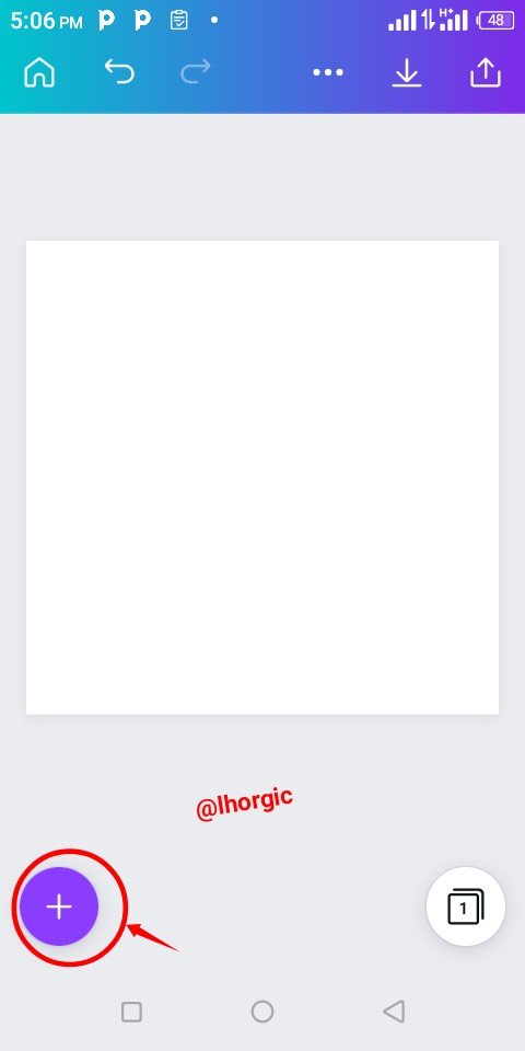
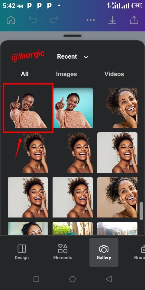
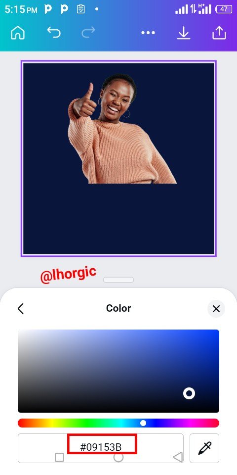
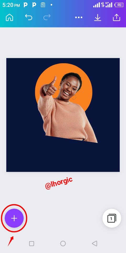
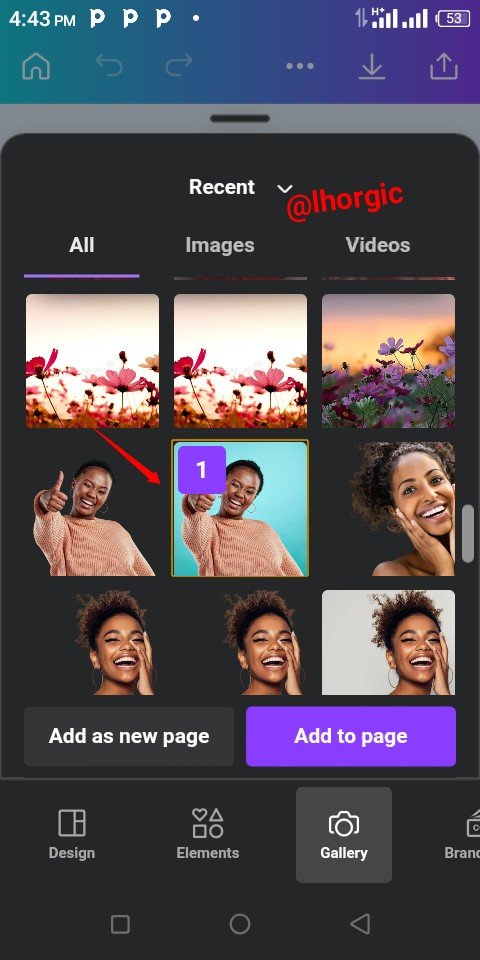
Start by choosing a size of your choice and wipe it clean then click the "+" just as highlighted below to bring in your desired cropped image. You could get yours cropped as well using remove.bg site. When your image comes into your workspace, you can then change the colour of the background.
 |  |  |
|---|
- Step 2
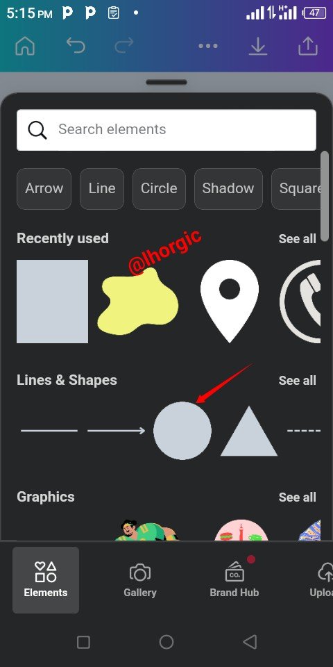
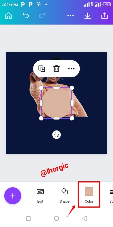
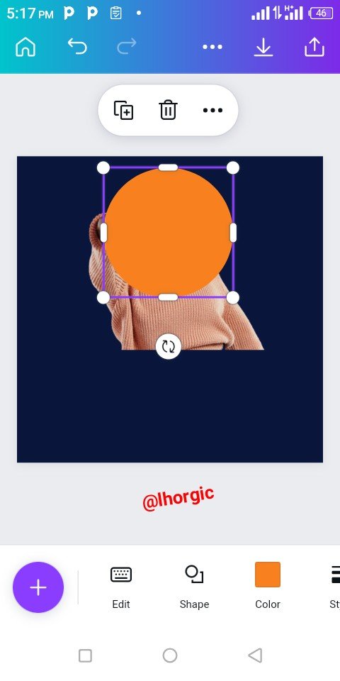
Introduce a circle shape by clicking the "+", under element, you will locate shapes or better still search for shape using the search bar. When it appears place it strategically on your image just as seen below.
 |  |  |
|---|
- Step 3
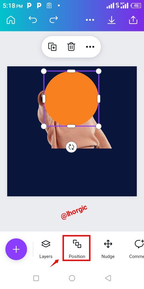
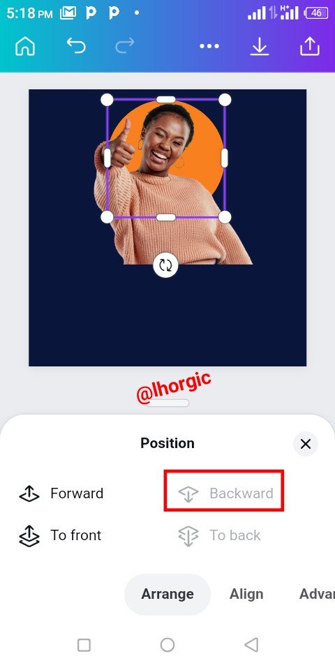
Locate the Position icon, click on it and then select backward to put our circle shape behind our image to give it a nice effect just as seen below.
 |  |  |
|---|
- Step 4
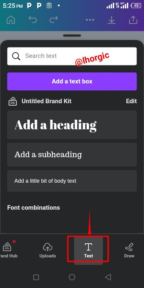
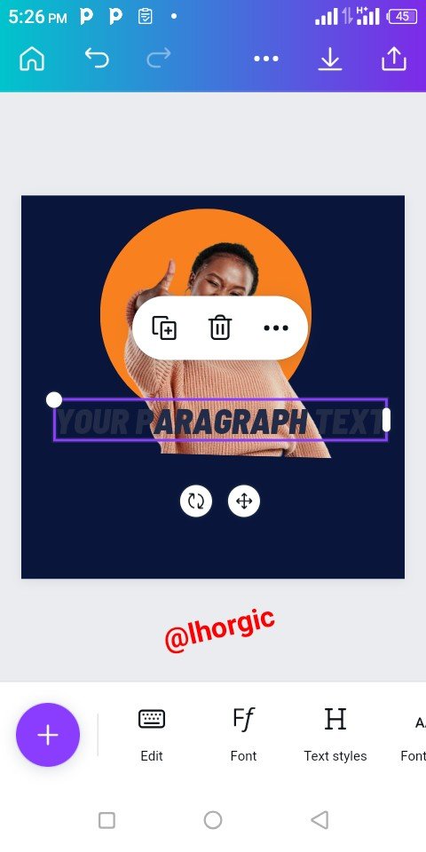
Introduce your text. I used Amsterdam font for the thumbs up and the Montserrat font for the others. You can see that below.
 |  |  |
|---|
- Step 5
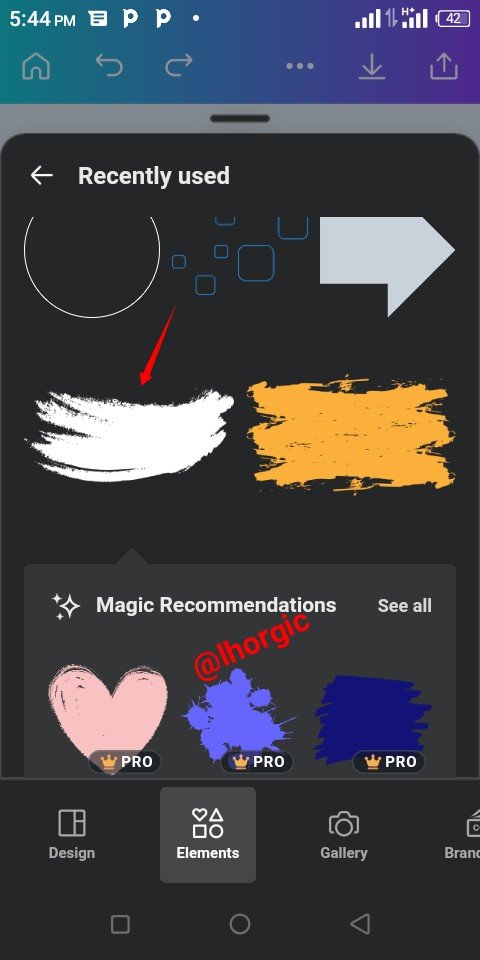
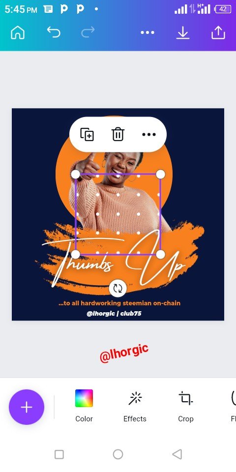
I introduce two nice elements to create a beautiful effect on the design. The first, a brush kind of effect to cover the exposed part of our image and the a doted element to beautify the corner of the design. Do well to resize and position just as seen.
 |  |  |
|---|
- Step 6
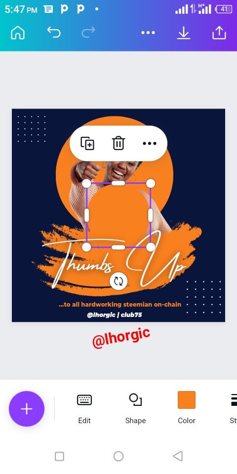
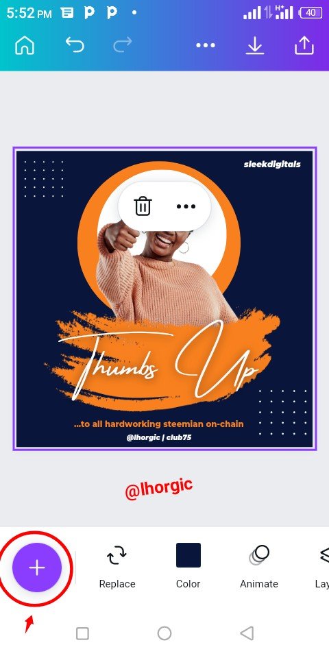
I introduced another circle,I resized it to be a bit smaller than the previous, I then used position tool to send it direct behind our image and then we got that nice effect which made the image come out more obvious and beautiful
 |  |  |
|---|
- Step 7
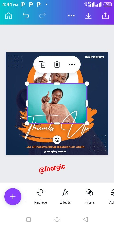
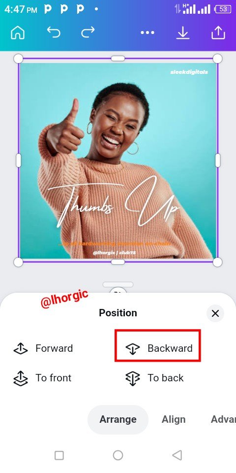
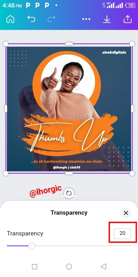
I needed an effect for the background, so I brought in the uncropped image form we used in the beginning and then resized by making it fill up the workspace ( you might not need to fill up yours as you will later see in mine). Afterward, I positioned it to the back of all our elements and then used our Transparency tool to make it fade out into the background. The parameters used was 20% just as seen.
 |  |  |
|---|
- Step 8
 |  |  |
|---|
Here is our final design. It came in two folds depending on your preference, you could manipulate as much as you want just as I did with this design.


This is where I will be wrapping up our lesson for today. I really appreciate you for coming this far with me. I trust you got value from this lesson. Feel free to share your thought on today's lesson. If there is anything you would love me to add to improve the lesson, be free to share in the comment section.
If you missed the previous posts on this beginners class, kindly check them out here.
G101 introduction post.Lesson 1.Lesson 2.Lesson 3.Lesson 4.Lesson 5.Lesson 6.Lesson 7.Lesson 8.Lesson 9.Lesson 10.Lesson 11.Lesson 12.Lesson 13.Lesson 14.Lesson 15.Lesson 16.Lesson 17
Graphic Instructor
@lhorgic♥️
Cc: @ubongudofot.
