Hi friends!
This is the exercise done by @stef1 three days ago, corresponding to homework #3 27-HW Contest .
You can find her work and step-by-step explanation here: @stef1/homework-drawing-like-a-pro-week-3-w-jorgevandeperre
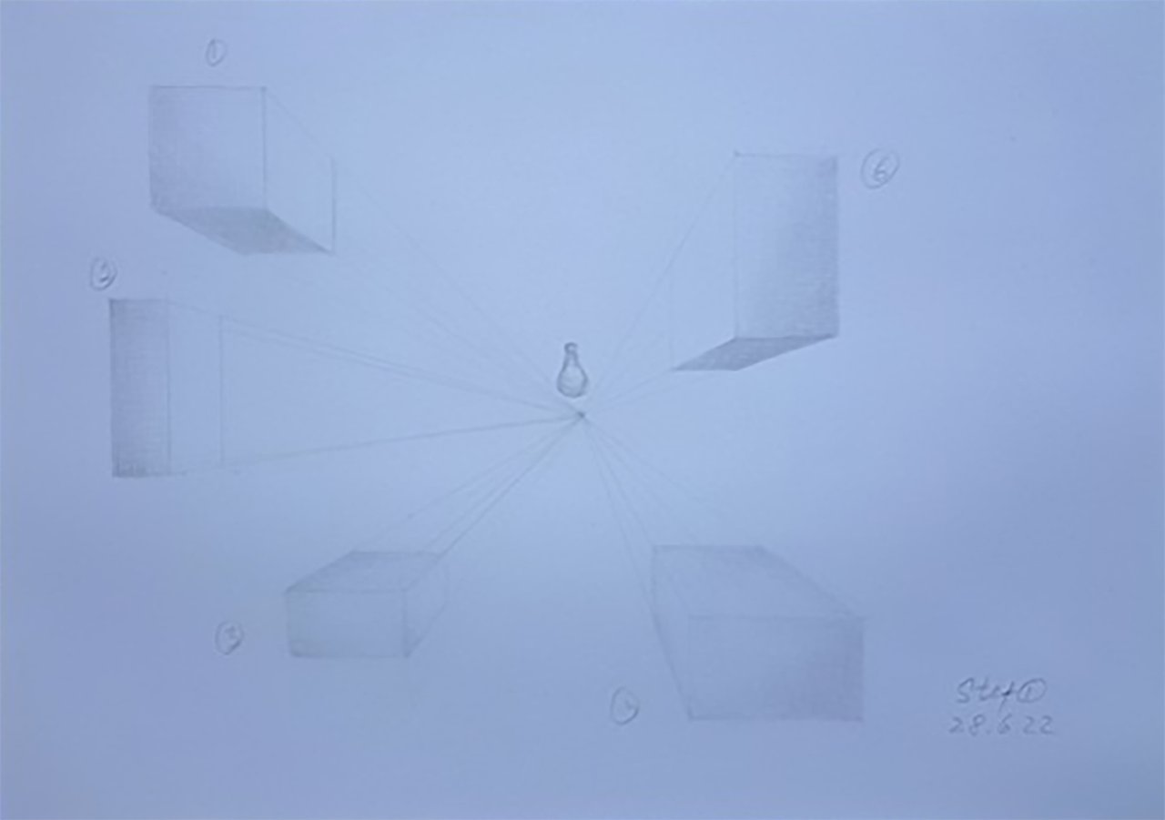
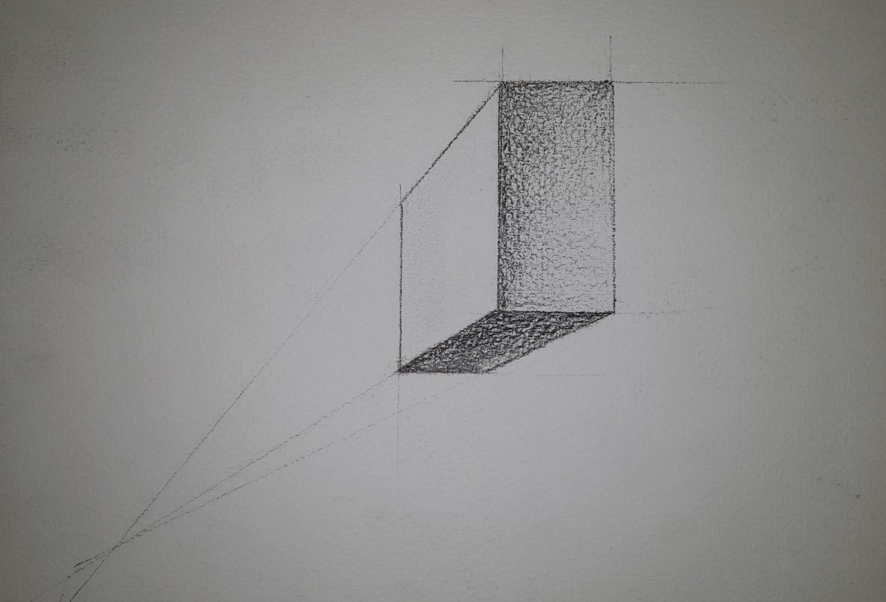
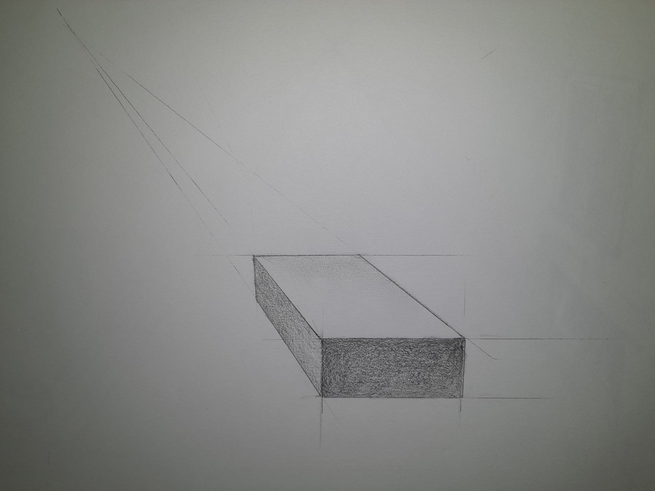
The homework was perfectly accomplished, the objective of this exercise was to draw several squares and rectangles in different locations following the steps taught in 27-HW Contest and in Masterclass, One Point Perspective to represent them as volumes in space.
@stef1 goes a step further in this exercise, instead of giving different shades to differentiate the faces of the shapes, she has chosen to create a point of light in the centre of the drawing to define shadows on the shapes.
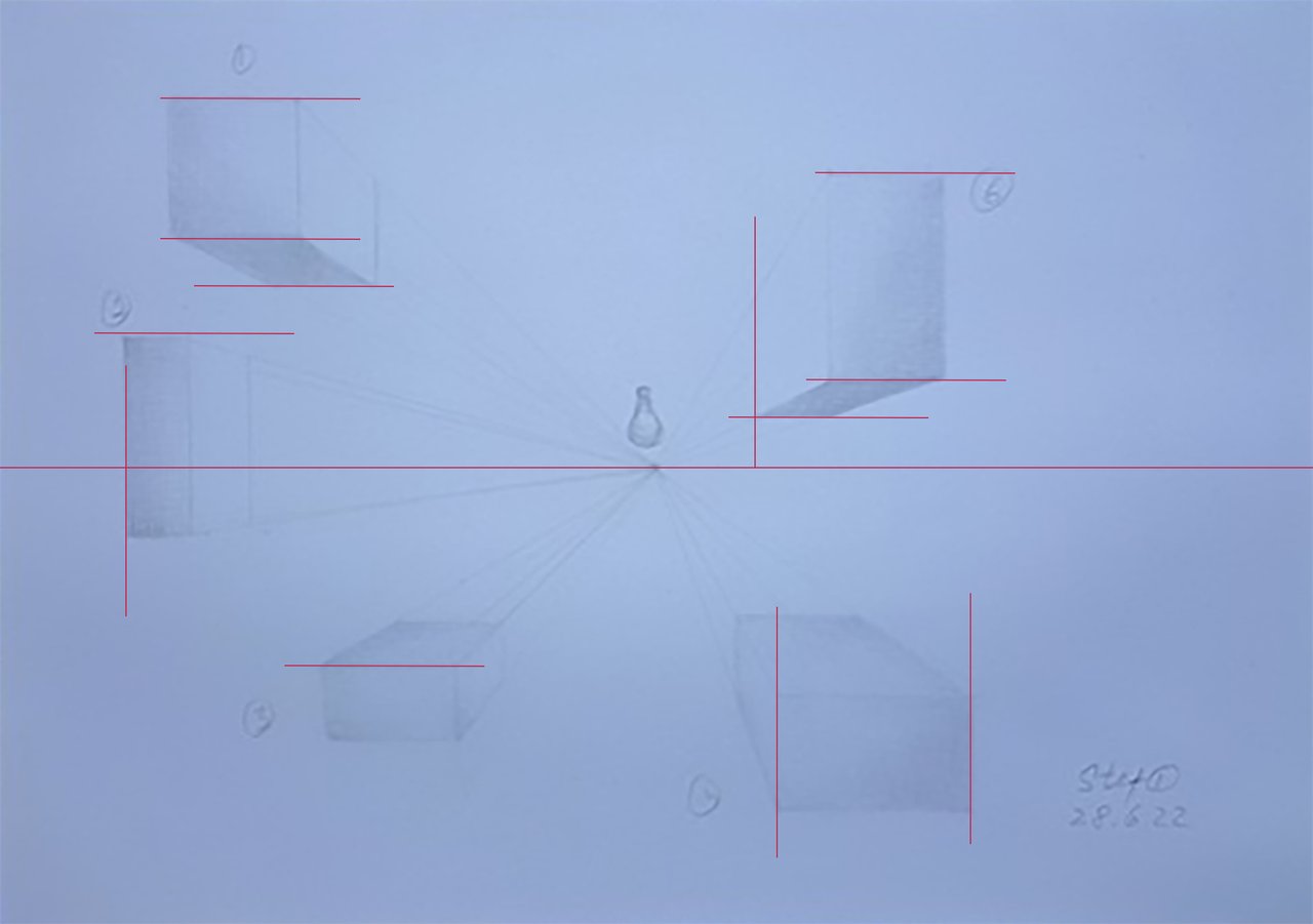
Lights & shadows is a subject that we have not yet seen, so the initiative to try to go beyond the lessons is appreciated.
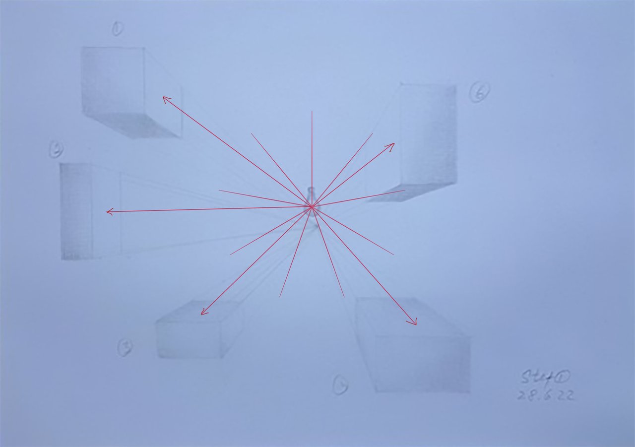
I have marked with arrows where the light should come, we see that there are two faces (3 and 4) badly shaded. Here the top face should be the lightest in both shapes.
The second problem I see is the wrong direction of the shadow gradient, it should be the opposite, as I show you in the ones I have drawn.
Soon we will see it in detail.
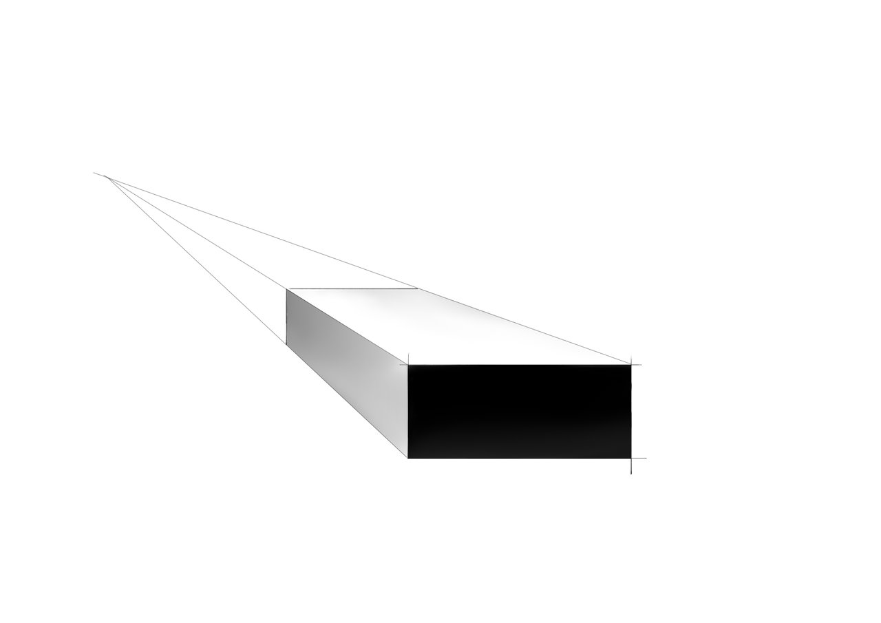
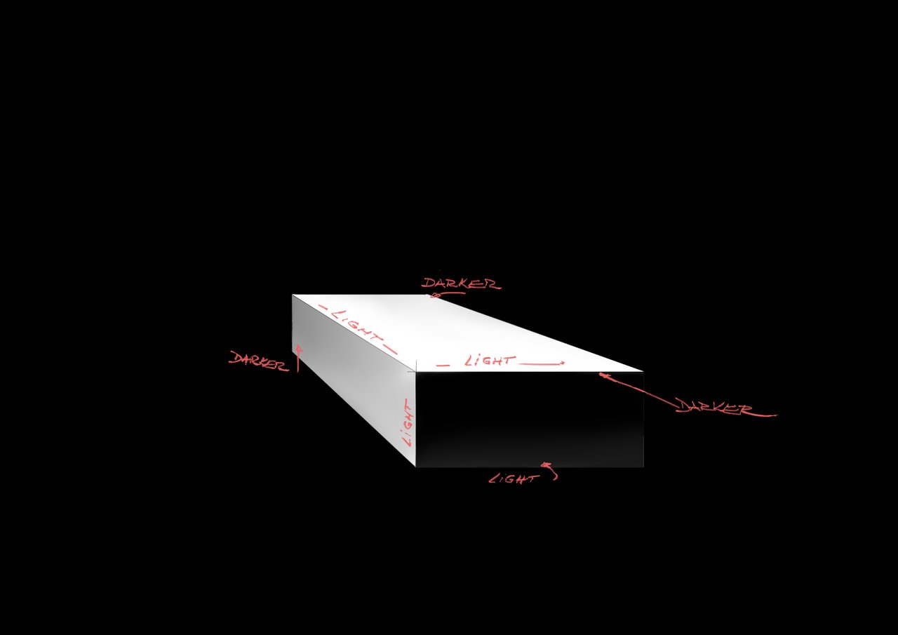
Sample for shape #6. Notice how the darker side of one face meets the lighter side of the other at the vertex.
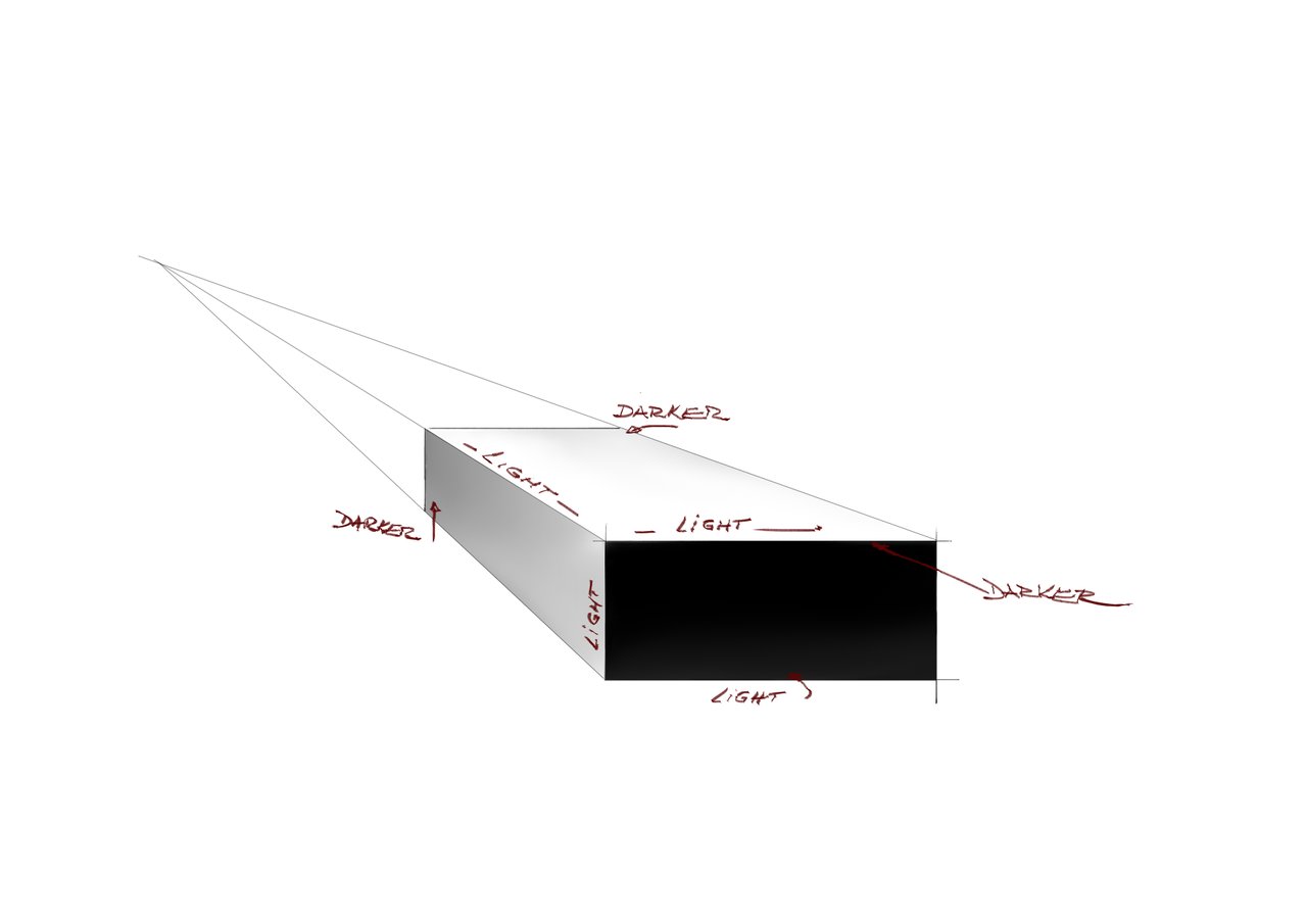
Sample for shape #4. See here how the gray side on the left becomes lighter as it approaches the dark side. The same for the top face of the rectangle.
Examine these digital drawings that show more clearly what happens to tones when opposing one another and also see the relativity of the tones related to the surrounding tones.

Answering your questions
Shape #6
The shadow's gradient should be in the opposite direction from what you drew due to the reasons explained above.
Shapes #3 & #4
Yes, you're right, the top should be lighter than the inner inside due to the light. The same for both rectangles.
Shapes #1 and #2
Draw the shaded side with the gradient in the opposite direction, as explained above.
For shape #2, maybe if you resize it, making it much longer to break the symmetry a bit.
Tips and tricks
Don't be afraid to increment the difference between the shades. You can.
By making the darker areas stronger, the lighters ones become even lighter.
Take part in this # 4 HOMEWORK CONTEST!
and get upvotes rewards from WOX community members.
Here are the links to the previous related posts.
1-Introduction - 2-Introduction - 3-Introduction - 4-Introduction -
5-Introduction - 6-Lesson - 7-Lesson - 8-Lesson - 9-Lesson - 10-Lesson -
11-Masterclass - 12-HW Contest - 13-Lesson 14-Lesson - 15-Lesson -
16-Lesson - 17-HW results - 18-Masterclass - 19-HW Contest - 20-Lesson - 21-Lesson - 22-Lesson - 23-HW results - 24-Lesson - 25-Lesson -
26-Masterclass - 27-HW Contest - 28-Lesson - 29-Lesson - 30-feedback - 31-Lesson - 32-HW results - 33-Masterclass - 34-HW contest #4 - 35-feedback
Also, thanks to @xpilar for making these initiatives possible.
100% SP (manual transfer to SP)
#club100