Repository
https://github.com/flutter/flutter
What Will I Learn?
- You will learn how to make and use custom Floating action buttons
- You will learn how to customize the Bottom App Bar widget
- You will learn how to manipulate Path to create custom shapes
- You will learn about how you can create bottom drawers
- You will learn about VoidCallback types
- You will learn about the Rect type and how it can be used to make other shapes
- You will learn about Inkwells
Requirements
System Requirements:
- IDEA intellij, Visual Studio Code with the Dart/Flutter Plugins, Android Studio or Xcode
- The Flutter SDK on the latest Master Build
- An Android or iOS Emulator or device for testing
OS Support for Flutter:
- Windows 7 SP1 or later (64-bit)
- macOS (64-bit)
- Linux (64-bit)
Required Knowledge
- A little understanding of UI elements
- Some understanding of overriding objects
- A fair understanding of Mobile development and Imperative or Object Oriented Programming
Resources for Flutter and this Project:
- Flutter Website: https://flutter.io/
- Flutter Official Documentation: https://flutter.io/docs/
- Flutter Installation Information: https://flutter.io/get-started/install/
- Flutter GitHub repository: https://github.com/flutter/flutter
- Flutter Dart 2 Preview Information: https://github.com/flutter/flutter/wiki/Trying-the-preview-of-Dart-2-in-Flutter
- Flutter Technical Overview: https://flutter.io/technical-overview/
- Dart Website: https://www.dartlang.org/
- Flutter Awesome GitHub Repository: https://github.com/Solido/awesome-flutter
Sources:
Flutter Logo (Google): https://flutter.io/
Difficulty
- Intermediate
Description
Outline and Overview
In this Flutter Video Tutorial, we take a look at how we can create a custom bottom application bar widget as well as make custom Floating Action Buttons. This includes creating a floating action button that is not round as well as building a notch in the bottom application bar to better suite the new shape. In this tutorial, we also look at drawer widgets, inkwell widgets, and the VoidCallback function type.
Outline for this Tutorial
Pathing out Objects with Dart's UI library
Flutter has many of the Dart common libraries baked into it. One of the more important ones is the Dart UI library. Inside of this library, we can gain access to various different objects and functions which allow us to create different shapes. In order to create a floating action button that is not shaped like a circle, we need to use the Path object. A path is a one dimensional subset of a plane which consists of segments of various lines, arcs and beziers. These can be put together to create a shape.
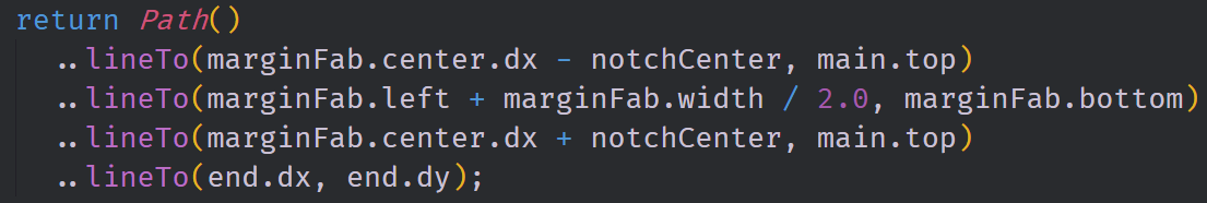
Above we have the path that is used to create the actual floating action button. We find an offset point where we want to start the shape at and then we create the shape by drawing from one offset to another. We are able to achieve this by using the lineTo method. This Path draws out diamond shaped floating action button. This floating action button also makes use of an Inkwell widget to give it a ripple animation effect.
Putting a Notch in the Bottom Bar
Based on the position of the floating action button in our application, we can have a notch in the bottom application bar widget. Because are new floating action button is not shaped like a circle, it makes sense to create a custom notch for it. The notch for this floating action button is computed in the floating action button class and it is then placed on top of our Bottom Bar.
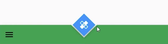
You can see the custom notch in this picture. We again use the Path object to create this notch and we draw a triangle with the path. This triangle is built by using the geometry of two separate rectangles; one from the floating action button's area and another based on the bottom app bar. We can make it look like it is cutting into the bottom bar by giving it no paint and making it into an "Open" shape.
Launching a Drawer from the Bottom
Often times it is useful to create a custom application bar to customize the layout of the application. Having customized the floating action button and notch, we also want to create a custom bottom application bar. Not only do we want this bar to be more distinct then the normal BottomAppBar widget, we also want to have the functionality to be able to launch a drawer from the bottom of the screen.
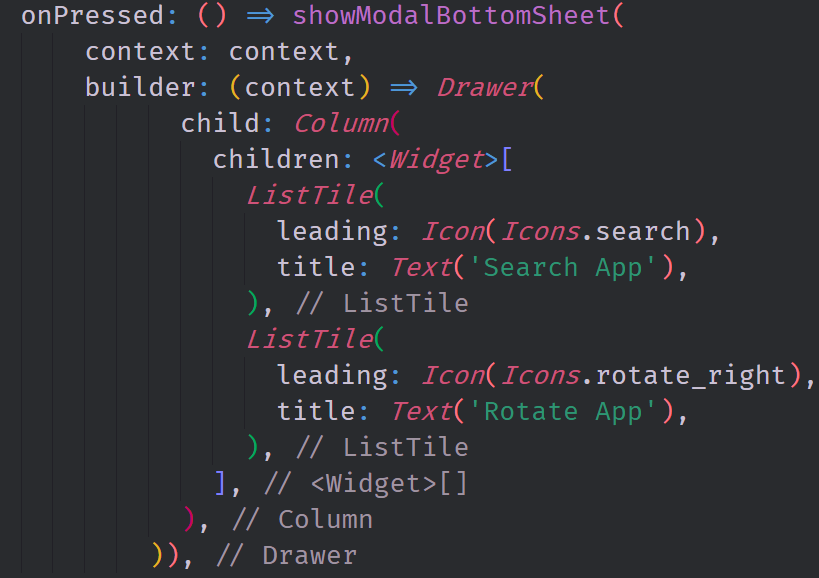
In this image, you can see the code that is used to actually launch this drawer from the bottom of the screen. We make use of an inbuilt function called showModalBottomSheet. This function allows us to create a builder function based on the context of the application. In the builder here, we build out a column with two listTile widgets inside of it to make it look a proper menu.
The source code for this project can be found here
Video Tutorial
Projects and Series
Stand Alone Projects:
- Dart Flutter Cross Platform Chat Application Tutorial
- Building a Temperature Conversion Application using Dart's Flutter Framework
- Managing State with Flutter Flux and Building a Crypto Tracker Application with Dart's Flutter Framework
Building a Calculator
- Building a Calculator Layout using Dart's Flutter Framework
- Finishing our Calculator Application with Dart's Flutter Framework
Movie Searcher Application
- Building a Movie Searcher with RxDart and SQLite in Dart's Flutter Framework (Part 1)
- Building a Movie Searcher with RxDart and SQLite in Dart's Flutter Framework (Part 2)
- Building a Movie Searcher with RxDart and SQLite in Dart's Flutter Framework (Part 3, Final)
Minesweeper Game
- Building a Mine Sweeper Game using Dart's Flutter Framework (Part 1)
- Building a Mine Sweeper Game using Dart's Flutter Framework (Part 2)
- Building a Mine Sweeper Game using Dart's Flutter Framework (Part 3)
- Building a Mine Sweeper Game using Dart's Flutter Framework (Part 4, Final)
Weather Application
- Building a Weather Application with Dart's Flutter Framework (Part 1, Handling Complex JSON with Built Code Generation)
- Building a Weather Application with Dart's Flutter Framework (Part 2, Creating a Repository and Model)
- Building a Weather Application with Dart's Flutter Framework (Part 3, RxCommand (RxDart) and Adding an Inherited Widget)
- Building a Weather Application with Dart's Flutter Framework (Part 4, Using RxWidget to Build a Reactive User Interface)
- Localize and Internationalize Applications with Intl and the Flutter SDK in Dart's Flutter Framework
Curriculum
- Building a Multi-Page Application with Dart's Flutter Mobile Framework
- Making Http requests and Using Json in Dart's Flutter Framework
- Building Dynamic Lists with Streams in Dart's Flutter Framework
- Using GridView, Tabs, and Steppers in Dart's Flutter Framework
- Using Global Keys to get State and Validate Input in Dart's Flutter Framework
- The Basics of Animation with Dart's Flutter Framework
- Advanced Physics Based Animations in Dart's Flutter Framework
- Building a Drag and Drop Application with Dart's Flutter Framework
- Building a Hero Animation and an Application Drawer in Dart's Flutter Framework
- Using Inherited Widgets and Gesture Detectors in Dart's Flutter Framework
- Using Gradients, Fractional Offsets, Page Views and Other Widgets in Dart's Flutter Framework
- Making use of Shared Preferences, Flex Widgets and Dismissibles with Dart's Flutter framework
- Using the Different Style Widgets and Properties in Dart's Flutter Framework
- Composing Animations and Chaining Animations in Dart's Flutter Framework
- Building a Countdown Timer with a Custom Painter and Animations in Dart's Flutter Framework
- Reading and Writing Data and Files with Path Provider using Dart's Flutter Framework
- Exploring Webviews and the Url Launcher Plugin in Dart's Flutter Framework
- Adding a Real-time Database to a Flutter application with Firebase
- Building a List in Redux with Dart's Flutter Framework
- Managing State with the Scoped Model Pattern in Dart's Flutter Framework
- Authenticating Guest Users for Firebase using Dart's Flutter Framework
- How to Monetize Your Flutter Applications Using Admob
- Using Geolocator to Communicate with the GPS and Build a Map in Dart's Flutter Framework
- Managing the App Life Cycle and the Screen Orientation in Dart's Flutter Framework
- Making use of General Utility Libraries for Dart's Flutter Framework
- Interfacing with Websockets and Streams in Dart's Flutter Framework
- Playing Local, Network and YouTube Videos with the Video Player Plugin in Dart's Flutter Framework
- Building Custom Scroll Physics and Simulations with Dart's Flutter Framework
- Making Dynamic Layouts with Slivers in Dart's Flutter Framework
- Building a Sketch Application by using Custom Painters in Dart's Flutter Framework
- Using Dart Isolates, Dependency Injection and Future Builders in Dart's Flutter Framework
- Looking at the Main Features of the Beta Three Release of Dart's Flutter Framework
- Working with Material Theme and Custom Fonts in Dart's Flutter Framework
- Using Cloud Firestore as a Realtime Datastore for CRUD with Dart's Flutter Framework
- Authenticating Users with Google Sign In and Firebase\Firestore inside of Dart's Flutter Framework
- Using the Elm Architecture or the MVU pattern with Dartea inside of Dart's Flutter Framework
- Using the BloC Pattern to Build Reactive Applications with Streams in Dart's Flutter Framework
- Building Immutable Models with Built Value and Built Collection in Dart's Flutter Framework
- Building Pure Dart Libraries and Packages for Dart's Flutter Framework
- Using Plugins to Interface with Android or iOS with Dart's Flutter Framework
- Using Firestore Storage and Caching Files inside of Dart's Flutter Framework
- Using Tab and Scroll Controllers and The Nested Scroll View in Dart's Flutter Framework